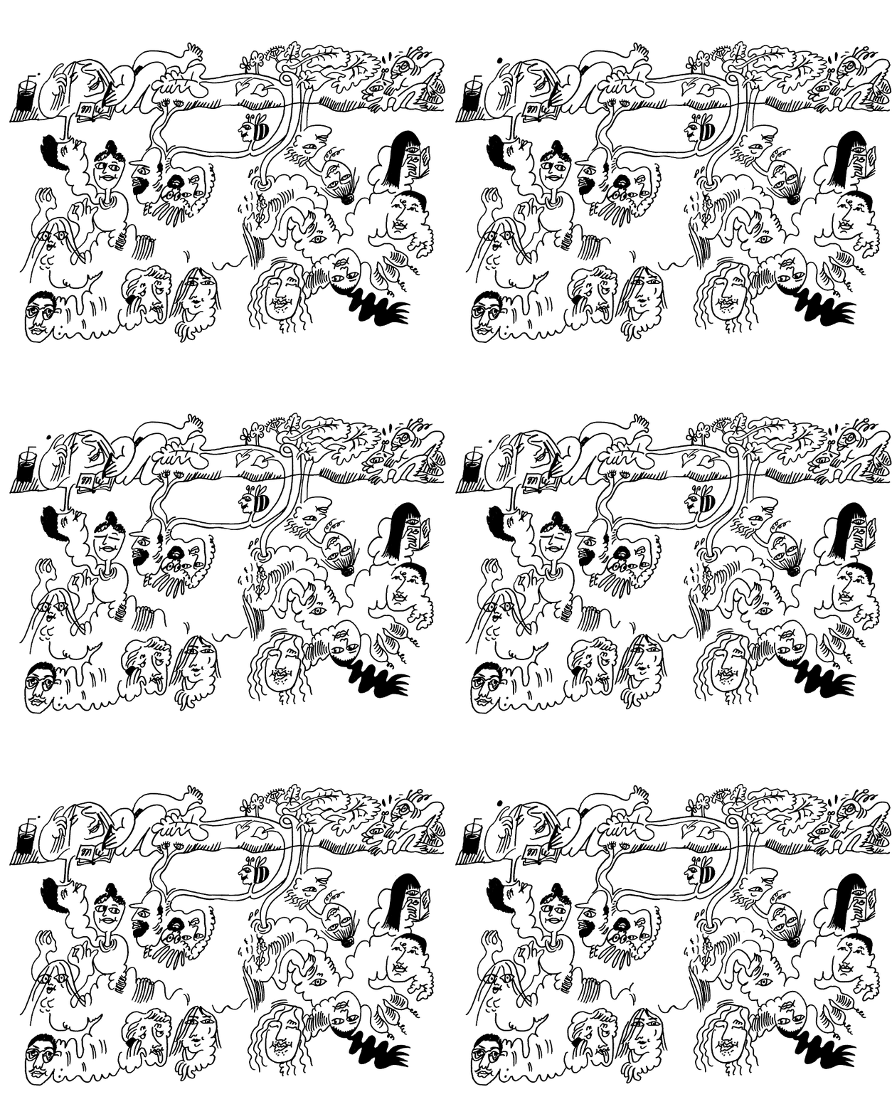
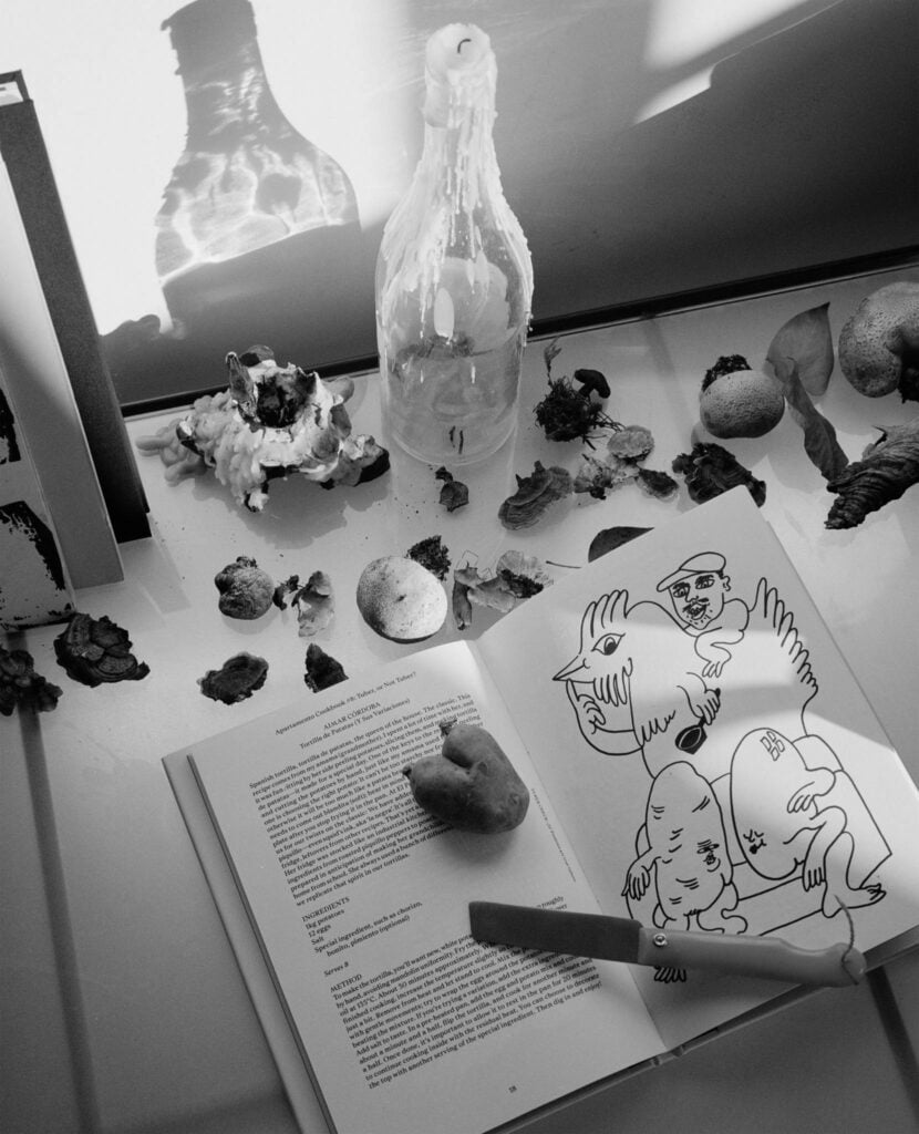
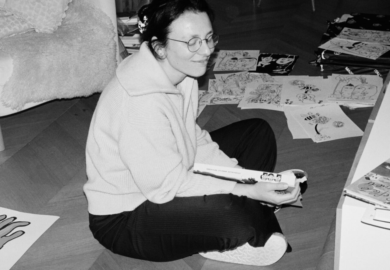
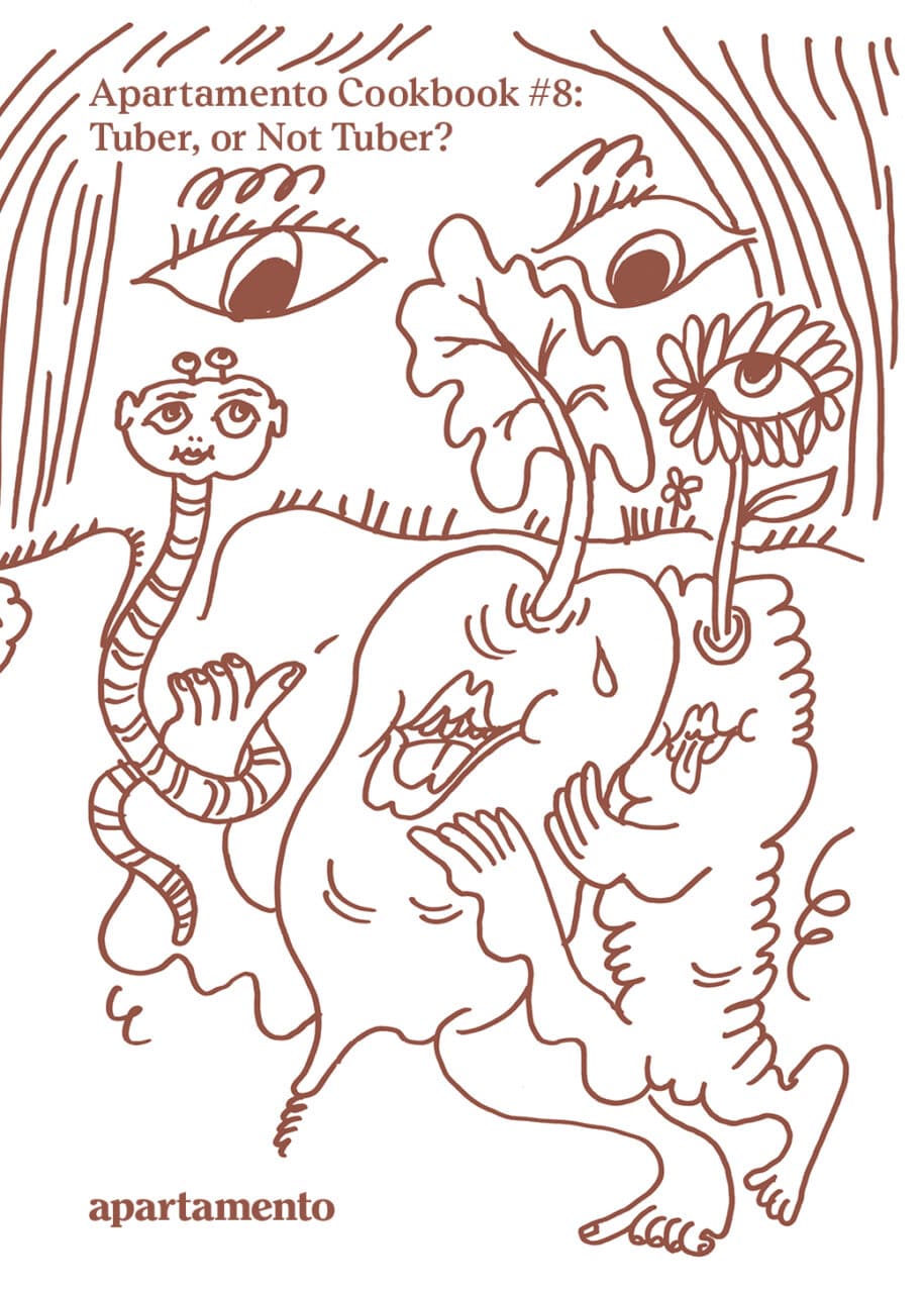
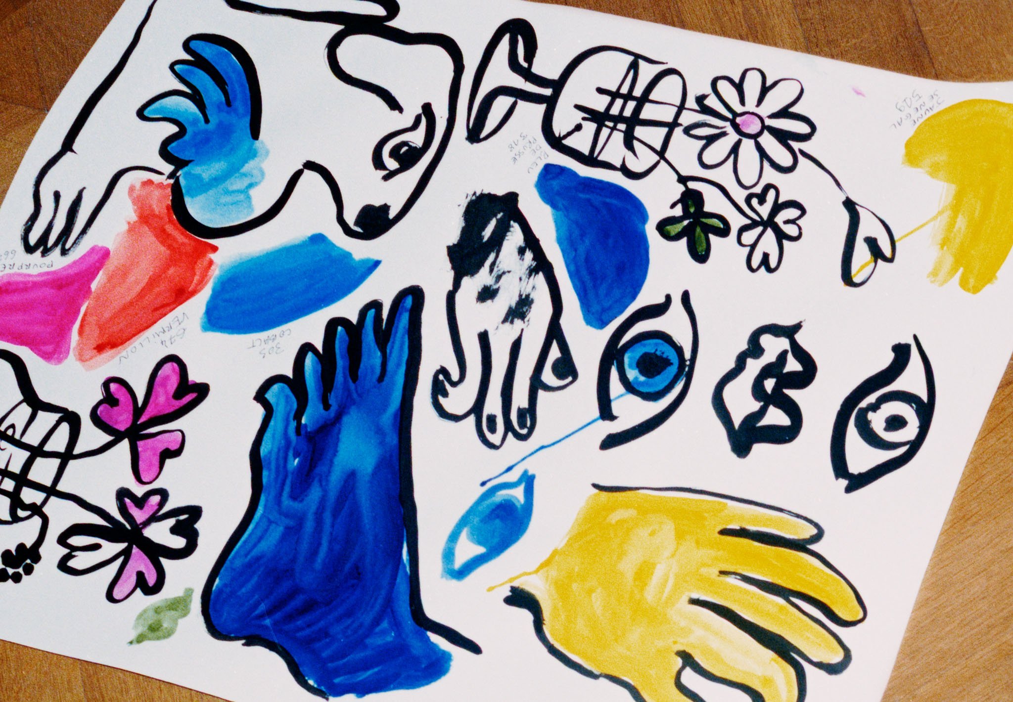
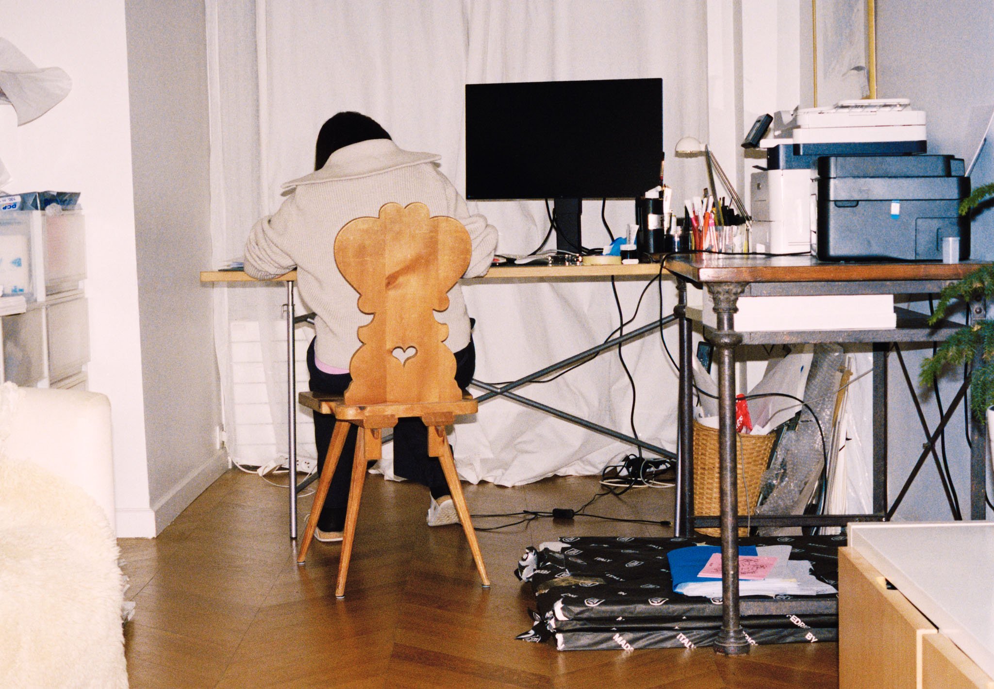
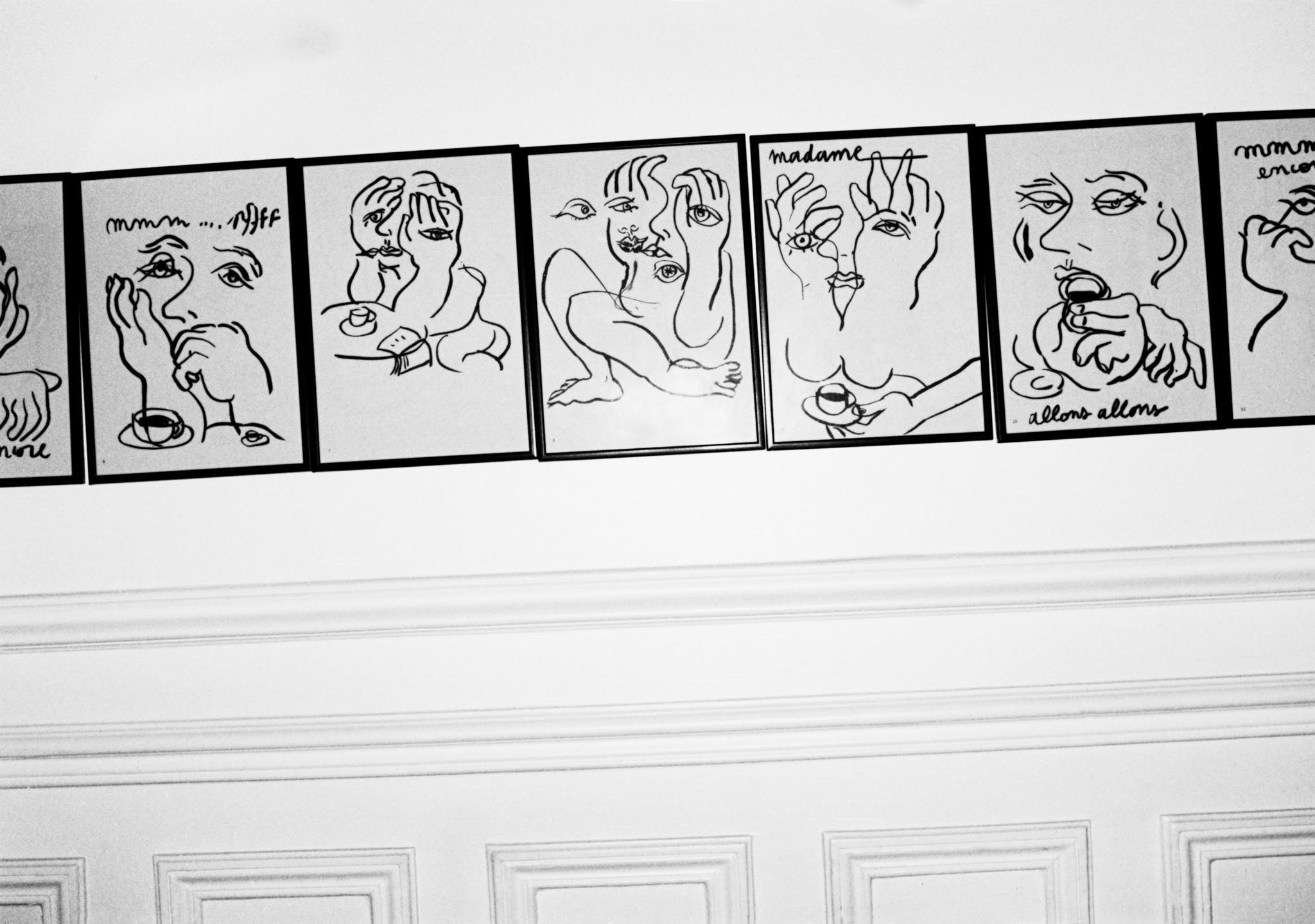
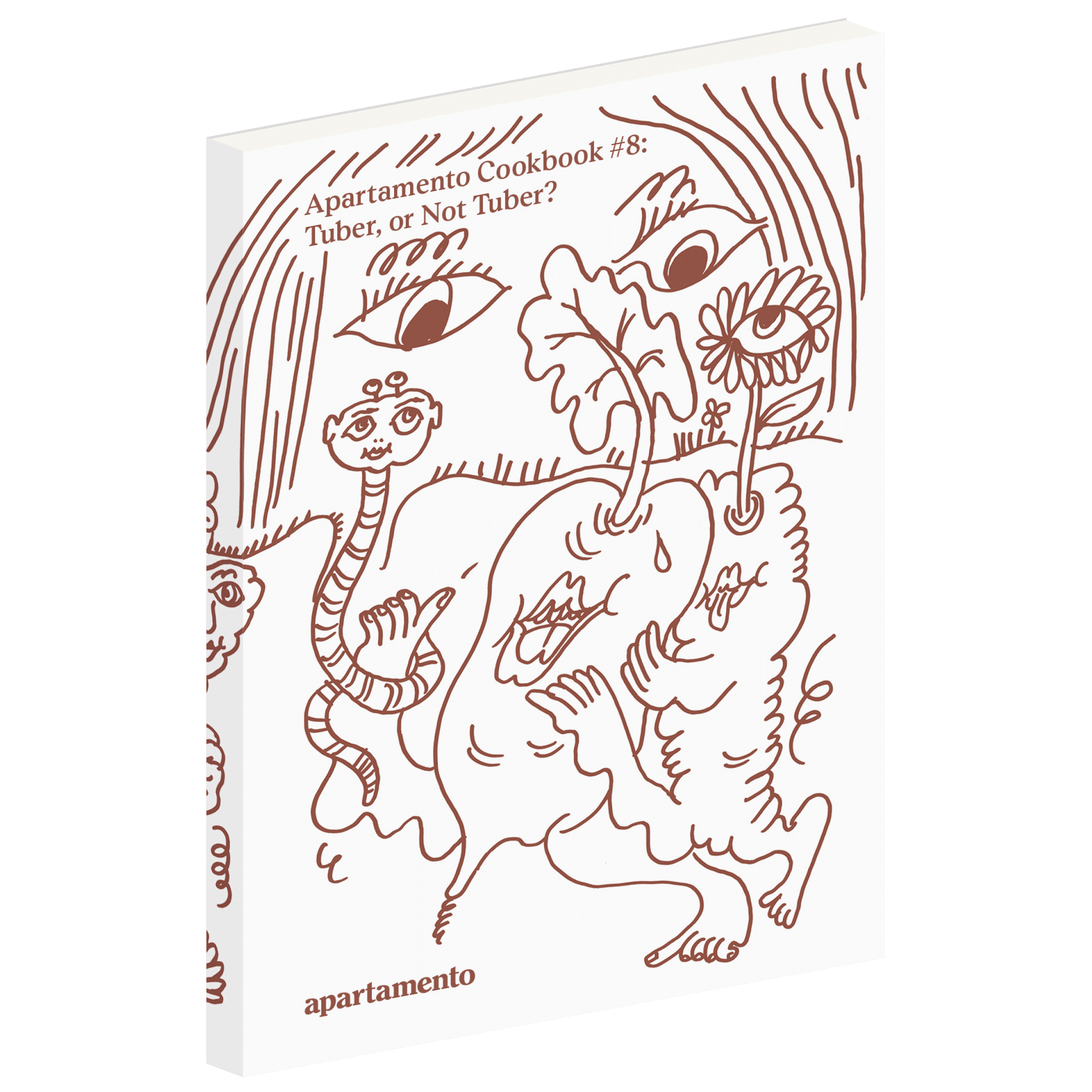
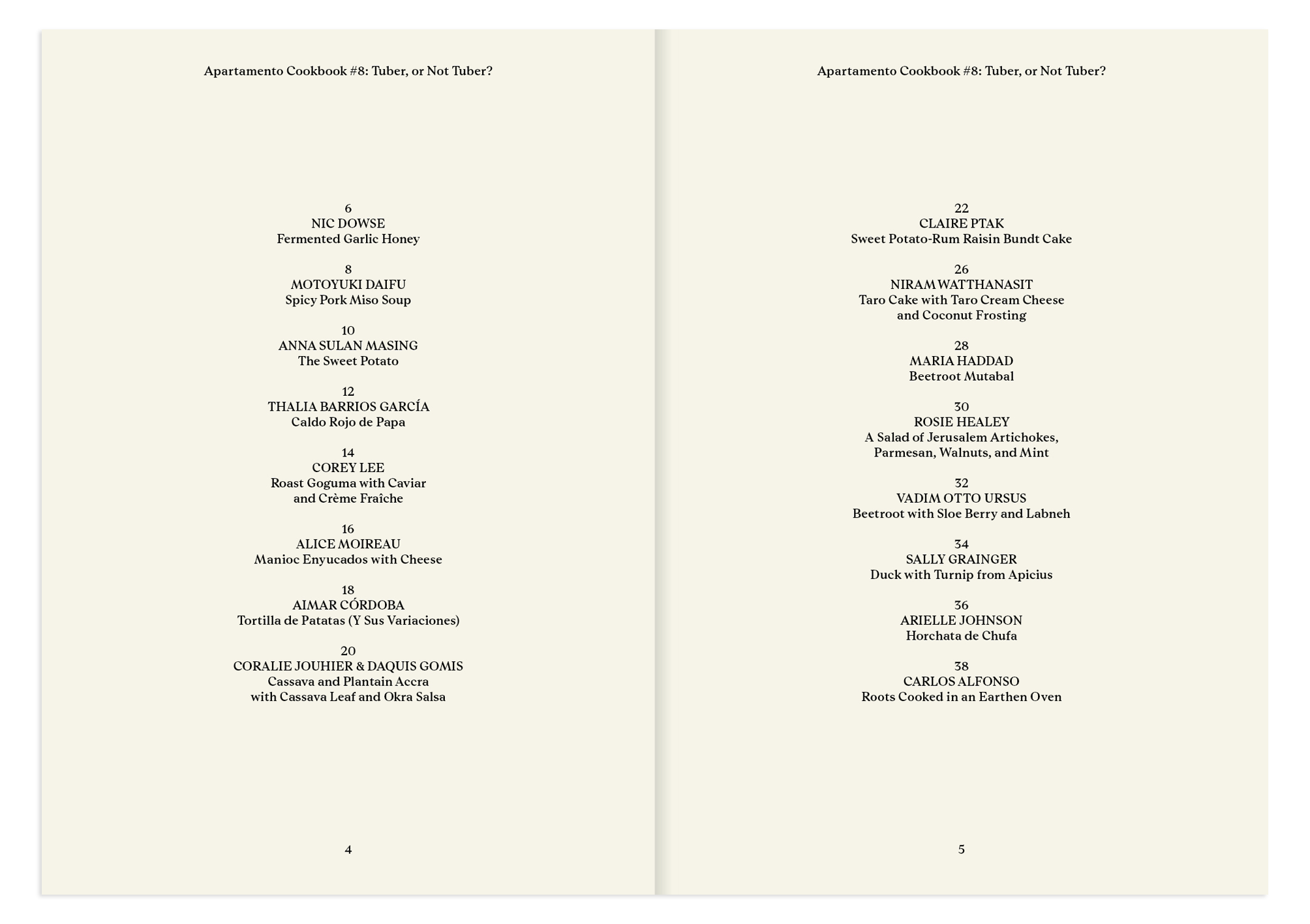
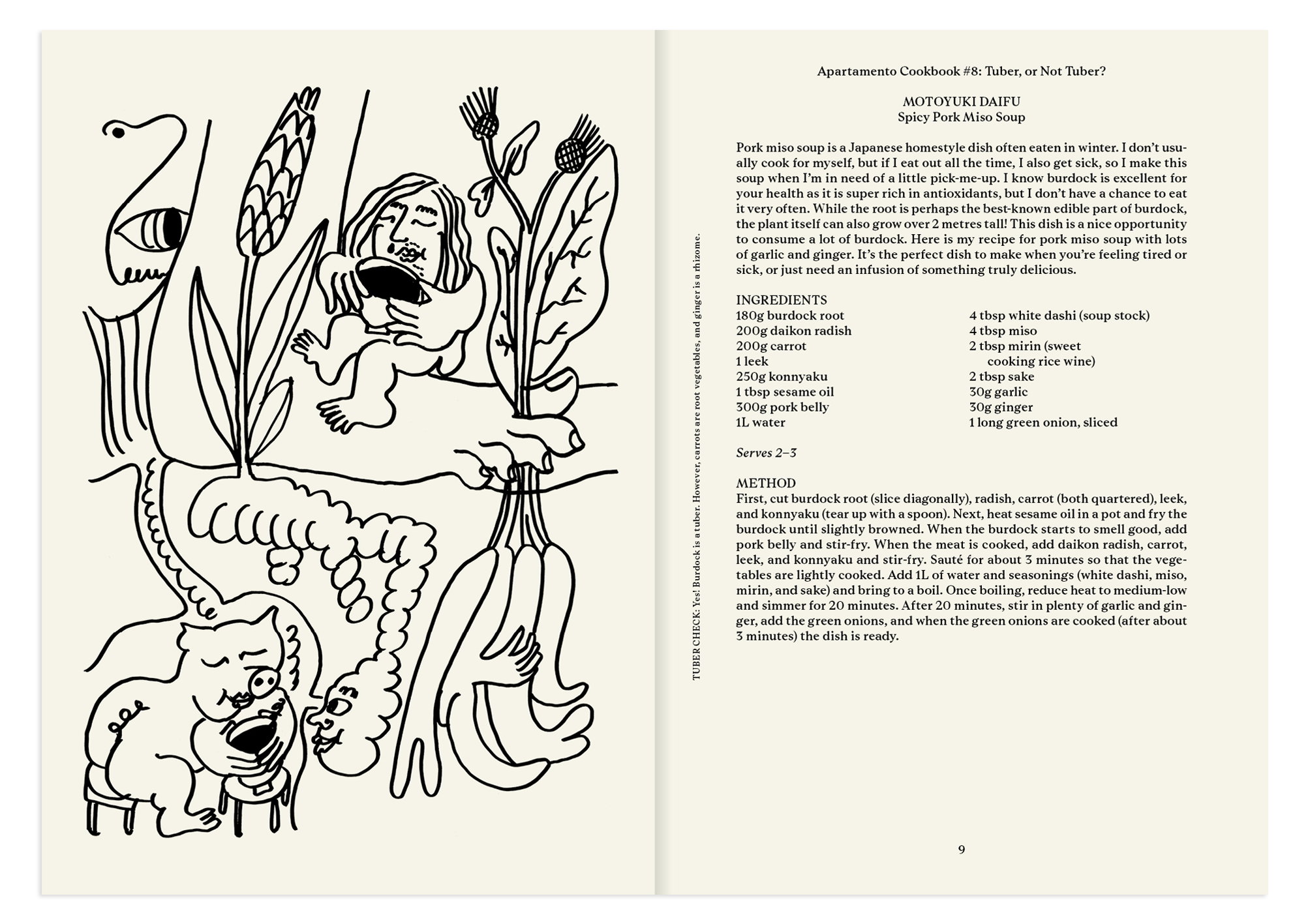
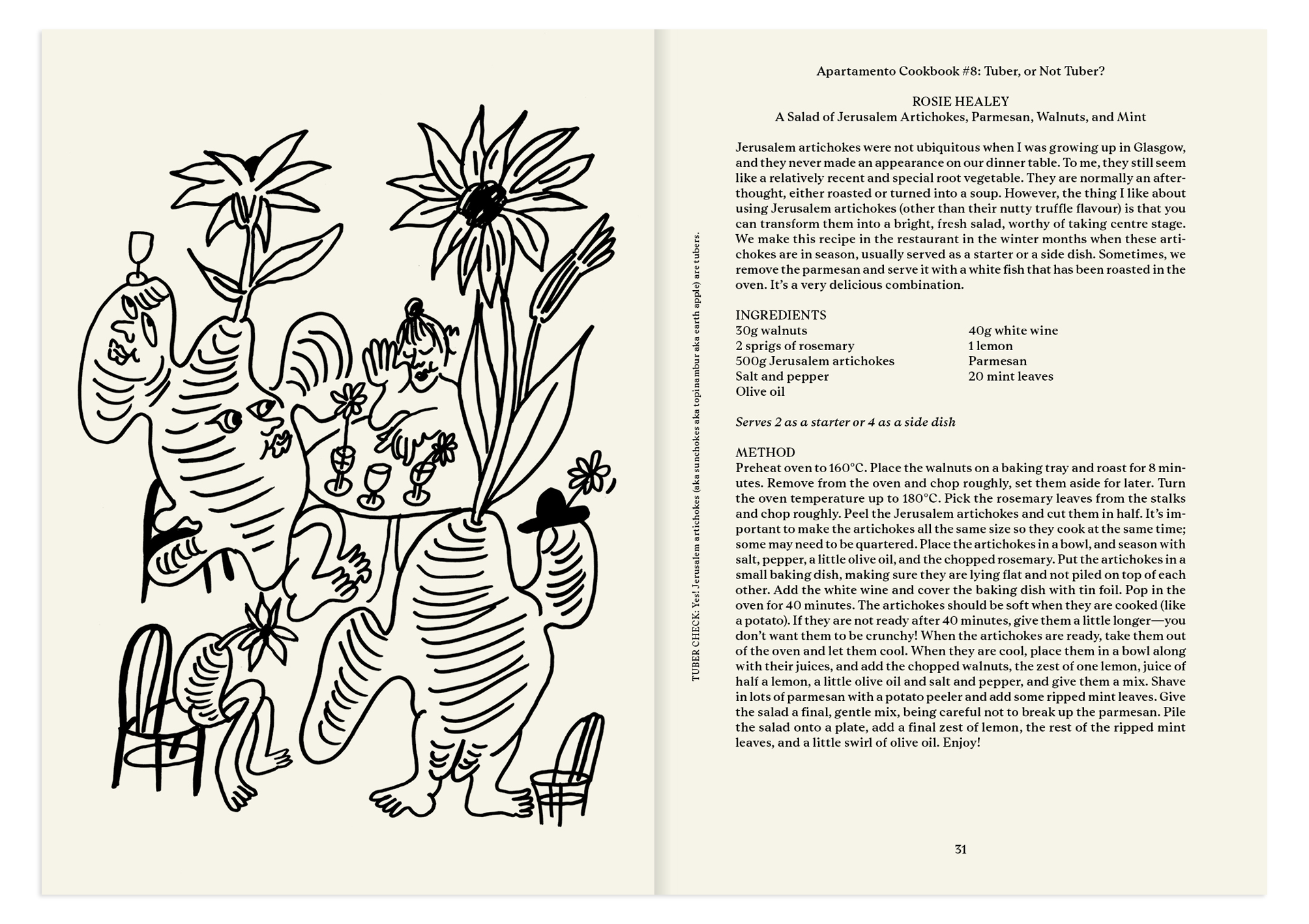
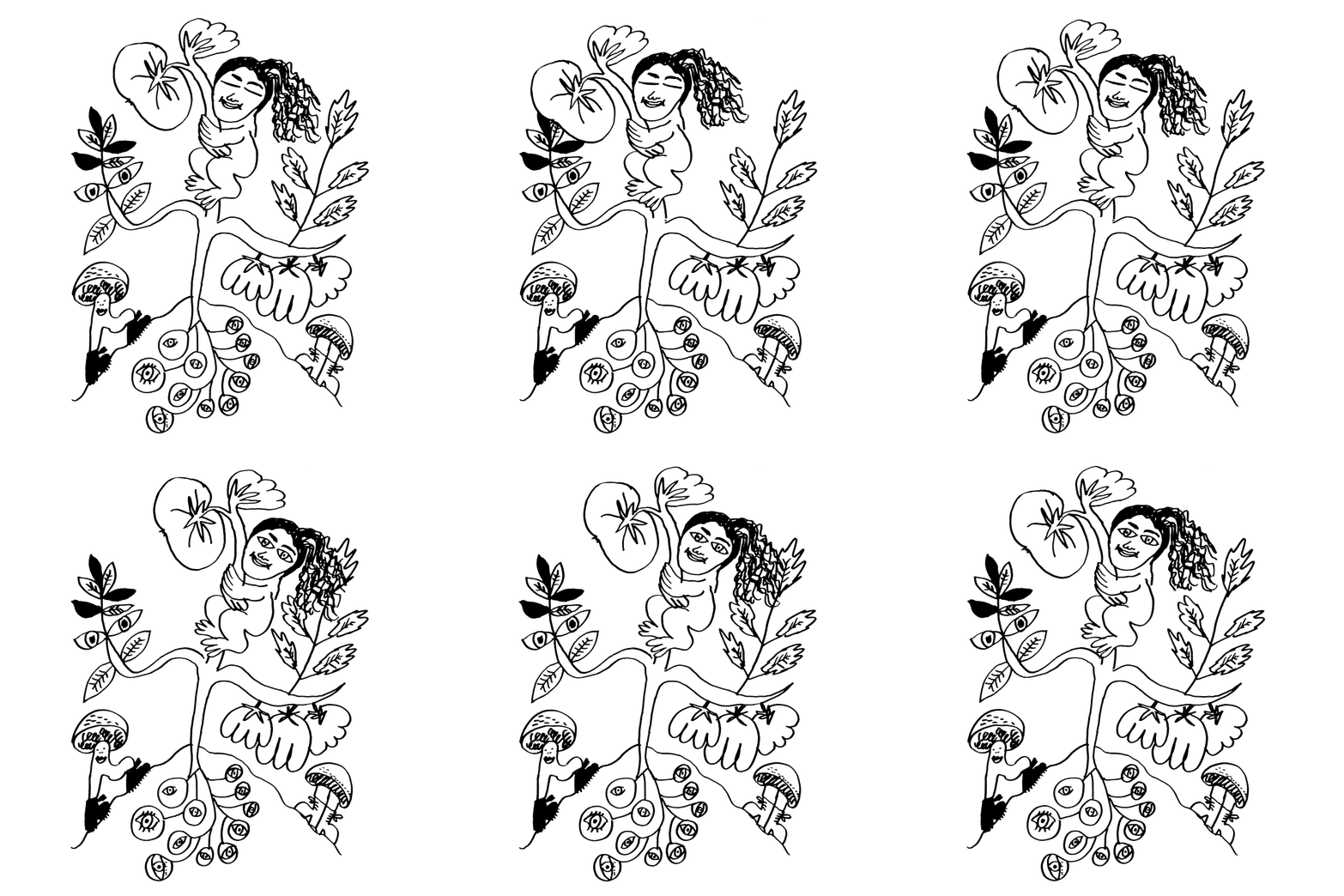
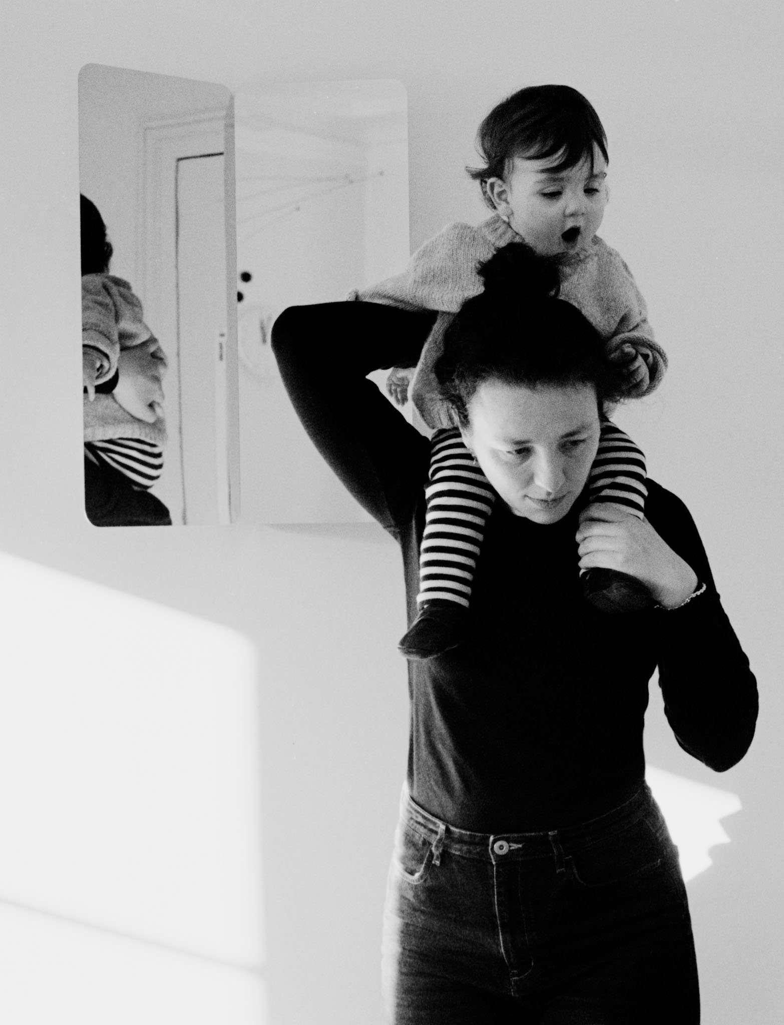
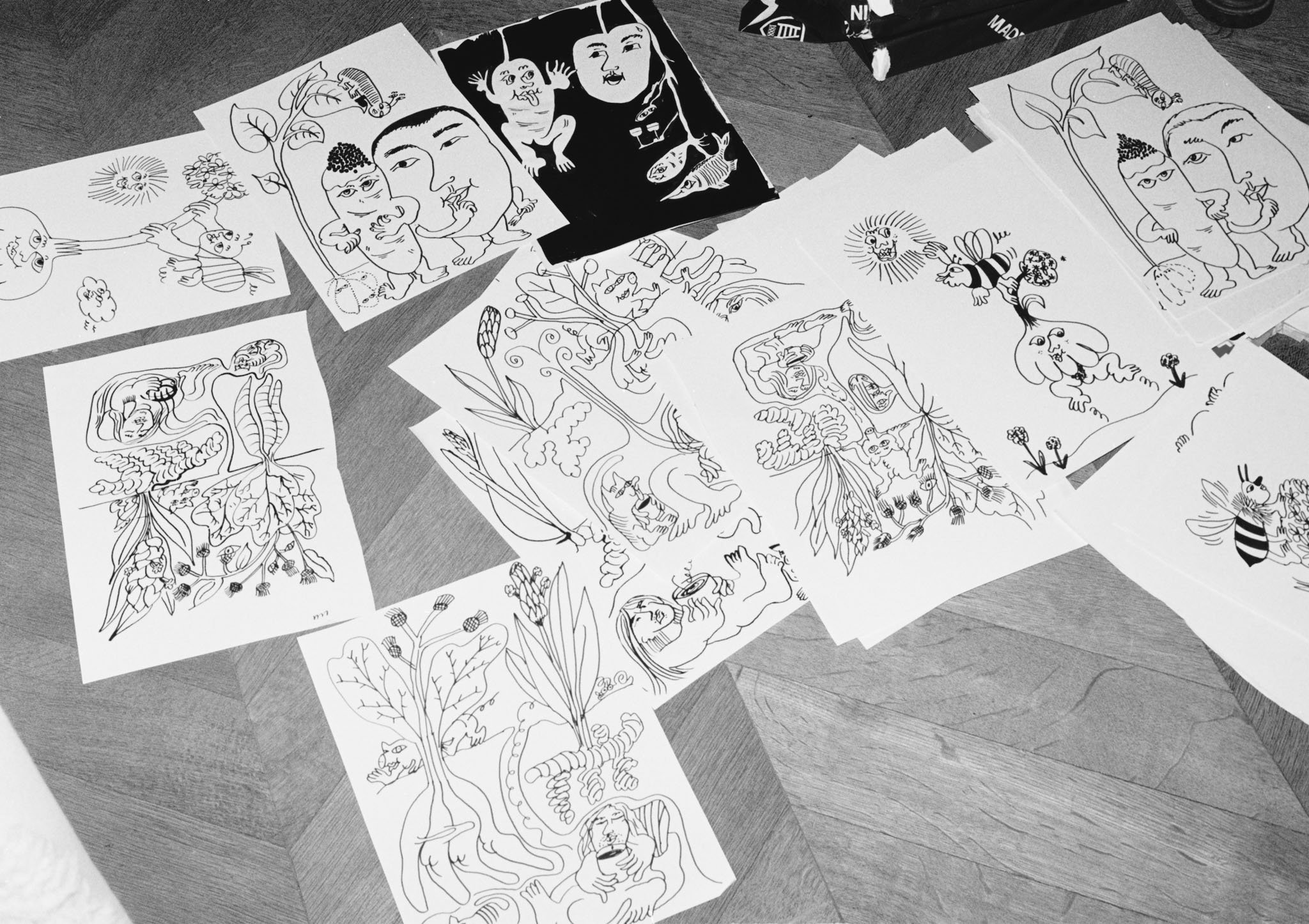
Paris: Imagine you have to illustrate a cookbook set in an underground world. A chef—let’s make him a tiny chef, to fit this environment—is as small as an insect. Suddenly, the chef is preparing a sauce, so maybe the chef should be a duck so that he can dip himself into the sauce. Now the duck is a chef is a duck, and the animals that have been comically following him around become vegetables. Vegetables become people, and people become animals. This is more or less how the process unfolds inside Swiss illustrator Olga Prader’s head the moment she gets swept into a drawing—in this instance, one for ‘Duck with Turnip from Apicius’, a recipe by Sally Grainger. Olga is the illustrator of Apartamento Cookbook #8: Tuber, or not Tuber?, the latest instalment in Apartamento’s annual series. She is a graphic designer, art director, and, more recently, an illustrator based between Paris and Ftan, Switzerland. Olga studied graphic design in Lausanne and moved to Paris for love (towards a person, not towards the city). She’s worked with fashion brands such as Balenciaga, Loewe, and Arket, and from 2014 to 2017, she worked at the design studio M/M in Paris. In 2021, her illustration work won the Swiss Design Award. Olga’s process is torrential, a crushing burst of creativity that she follows as she generates variations of an idea, and at every step, she reinvents, reimagines, and invigorates a scene. Her drawings are like a static flip book. They have great dynamism and are made up of playful characters who are not always well-intentioned. Olga’s drawing practice is characterised by sharp social analysis. Her work is tinged with humour and eroticism, full of squealing creatures on the verge of any limits of decorum.
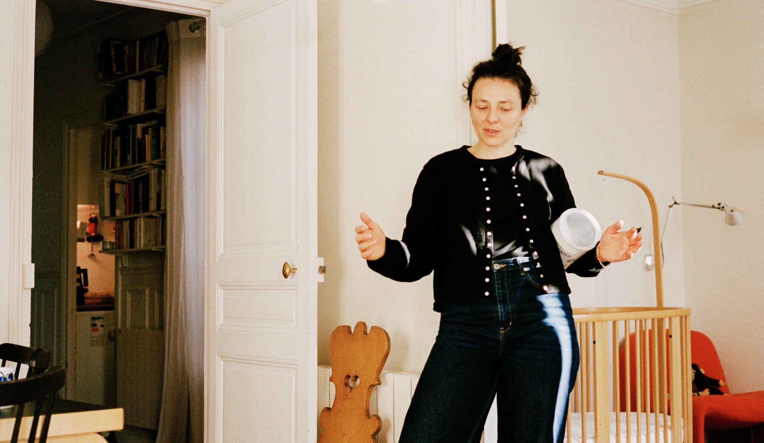
Olga Prader
When you were young, what did you want to be?
I wanted to be a jockey. You know, the guys riding horses very fast? But my mother is too big to be a jockey, so I was like, ’I will probably be the same’. I had to give up on this, because it’s really tiny people who are jockeys.
That’s so specific. I’ve never met anyone who wanted to be a jockey.
Really? They have nice clothes. I liked horses. I was a young girl. After that was an archaeologist, and then it was a fashion or textile designer. I wanted to do patterns. And then, in the end, it was graphic design. After high school, you have to do a year of a bit of everything to get into art school. I realised that textile design was so boring, so I thought it was better to do graphic design.
Where did you grow up?
I grew up between France and Switzerland because my parents were changing locations every six months for work. They work in the theatre; my mother is an actress and my dad is a director. We ended up in the suburbs of Paris, and that’s where I grew up as a teenager. My childhood was kind of split between France and Switzerland because my father is from Switzerland, and we went there quite a lot. My mother is from the north of France, but we never went there.
How did you get into drawing?
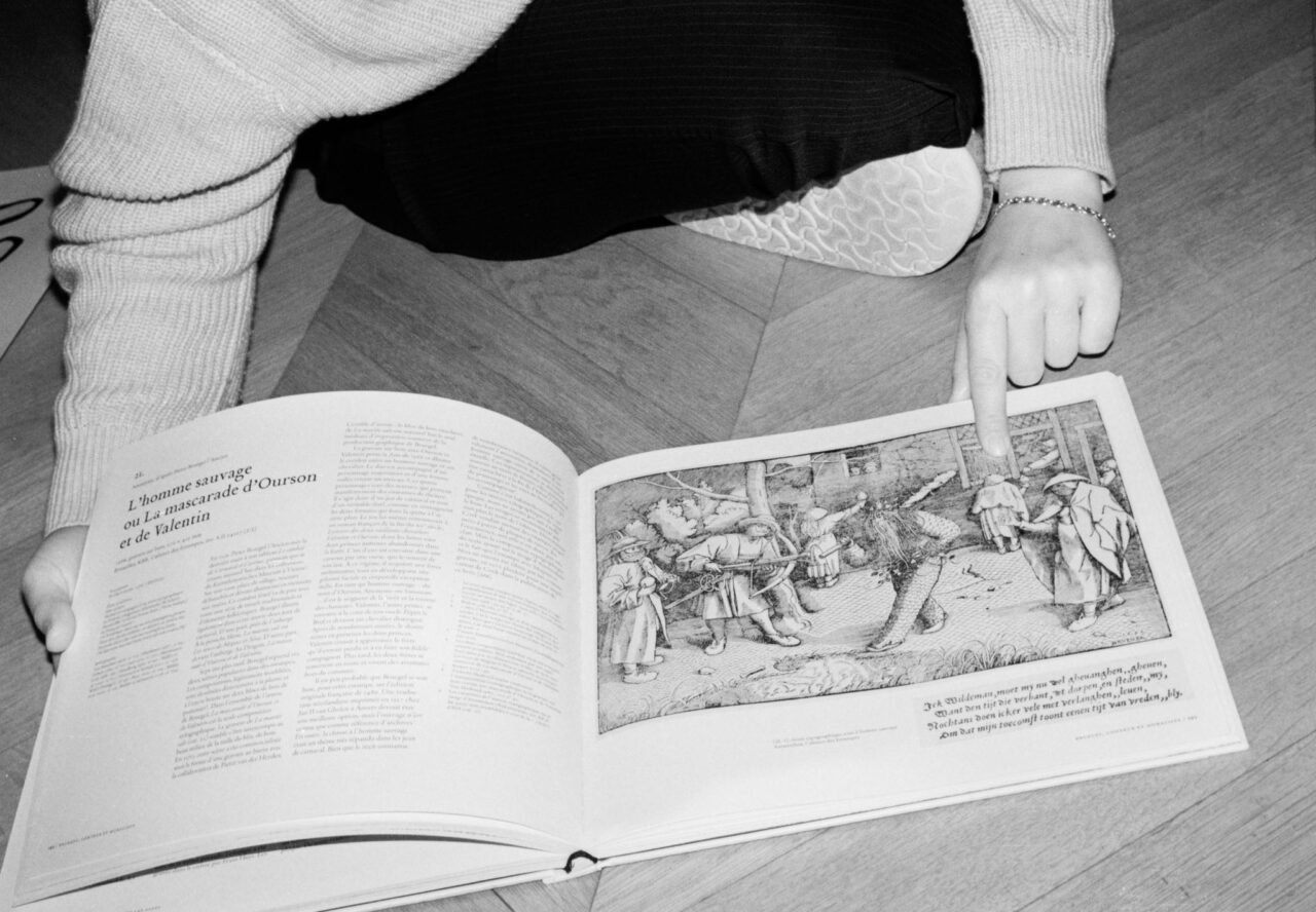
My grandfather was a doctor in Zurich. He was a fan of museums and books. I had full access to his books when he died. He had a lot of art books, like on Picasso. And he started collecting lots of etchings. I think that was when I thought, ‘That’s what I want to do’.
What other objects do you remember from your grandpa’s house?
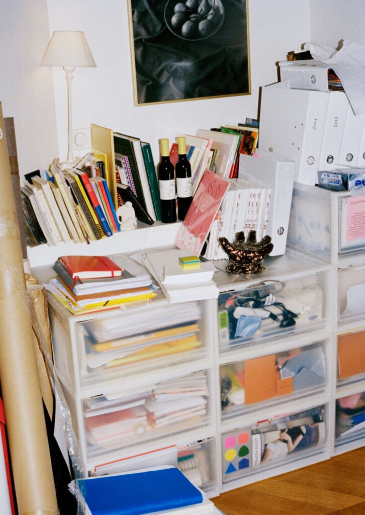
He bought lots of art—mostly prints, like etchings. I still look at his books, and sometimes I find one designed by a super Swiss graphic designer from the ‘80s or an artist I didn’t know about. It’s for sure the fact that this man bought art and books—I mean, hundreds of hardcover books and museum catalogues—that made me feel confident with doing drawings and knowing the art world exists. Not only theatre and cinema.
But you studied graphic design?
Now, that’s the complex part. After high school in France, I studied mathematics, philosophy, and Spanish. Between 15 and 18, you had to choose options. I picked mine, but there weren’t many choices. I was extremely convinced, from 15 to 20 years old, that I was really stupid, that I was an idiot, and I had to fight against it. I was very scared of not passing my final exam, of not being able to study what I wanted, and that it would prove to the world that I was an idiot. So I started working really hard. I think this was the reason why it was important to me to study philosophy and to excel in it. I also studied mathematics because I believe I have a mathematical brain. After that I stayed in France to study graphic design, but it was super boring, so I left. And then I did graphic design studies in Switzerland, at École cantonale d’art de Lausanne (ECAL).
I was always jealous of ECAL students. It seemed like every cool designer was coming out of there. But initially, when you started sending out your portfolio, were you mainly interested in drawing, or were you also interested in graphic design?
In France we had a lot of drawing classes, including drawing nudes and stuff. When I arrived in Switzerland, I was quite ashamed of my drawing practice. I thought it was not modern, not interesting, very girlish, very French. I was like, ‘No, no, I’m going to be a male graphic designer from Switzerland. That’s my goal, to do this craft. Not just nice drawings’.
Was it mostly about composition and layout? Graphic design is like being expressive through the use of grids and type.
Yes, graphic design can be expressive, but in a different way. I did an exchange at the Rietveld Academy in Amsterdam, and there was a teacher, a woman. When we introduced ourselves, I said, in my French accent, ‘I study in Switzerland. I’m interested in graphic design’. She said, ‘For me, French graphic designer women do nice drawings with flowers and butterflies’. This kind of remark confirmed to me that I had to shut down this part of myself. No one will take me seriously if I do that. I would do it differently, for sure, but even in my class, there were not so many women. It was mostly men. The teachers were only men, except for one great graphic designer and woman who was on maternity leave when I was studying, so she was replaced by her husband who’s a brilliant graphic designer, who I really admired. But there was no female reference.
There’s been some change over the past few years, but I think these kinds of stories help us understand the evolution that’s taken place throughout the art world recently. How did you cope in these environments?
The context was so different from one school to another. The director at the school in Lausanne was quite misogynistic, yelling at women and only being interested in men. It was a way to gain power and respect, which was quite stupid to me. But at the same time, during my first year in my bachelor’s, we had a workshop where we had to work in tiny groups. I got into a fight with the guys in my group, and the teacher suggested I go to the etching workshop to avoid them. He said I should do an etching of a portrait of the group, so I did. Then he suggested I present a project at a mini fanzine fair in Zurich that December. I got really crazy and decided to reproduce 50 etchings, which is a lot of work—just prepping the metal is tiring—and create a fanzine from quick drawings on those 50 etching plates. The idea came as some kind of—not a parody, but a way to paraphrase Picasso’s etchings. They are really horny and super repetitive. It’s beautiful, but it’s not very beautiful. It’s just an old guy painting women. I think it’s called the Vollard Suite. So I started from that. I was like, ‘I will do my series’. It’s with five characters. And they just sit next to each other, and it’s repetitive, and nothing happens. And it looks like Picasso. We printed the fanzine with Nieves. My classmates critiqued it, saying it looked like Picasso and that I didn’t invent anything. I was upset, but at the same time, I thought, ‘Yes, that’s the point’. It’s more about doing drawings like a graphic designer would, not showing who I am or expressing a lot. I’m just looking at things in a bit of a different way and printing it.
It’s like taking your own path to do something different from what is expected.
With the etchings project, it was really a tool to seduce people, to make fun and jokes with drawings. With a friend, we wanted to do an internship in London, and the guy would never reply. I started sending drawings, and he started replying. We ended up getting the internship. I felt like it was a way—
—of getting people’s attention?
Yeah, exactly. But in a nice, warm, very friendly way. Otherwise, it’s depressing.
I love what you said about using drawings as a seduction tool. Do you think this mix of being French and Swiss influences your humour or approach to seduction? There’s something in French tradition or illustration that’s more humorous or grotesque.
Yes, that’s true. The caricature part of the press. But at the same time, there is a Swiss humour, as well. If you look at Fischli and Weiss, there’s a humour that’s a bit off. I don’t know. I feel a connection to Picasso because of my grandfather. My parents didn’t read newspapers with drawings, for example. But Asterix and Obelix, I mean…
Major influences.
As a student, I didn’t look at lots of references. I went to the museum a lot, to the Louvre, the Musée d’Orsay, all the great Parisian museums. But even in Lausanne, there’s this big museum, the Collection de l’Art Brut, with a lot of drawings, and you can relate to a lot because it’s very funny, it’s very repetitive, it’s sometimes very sexual or very manic and obsessive. But I never felt the need to dig into their archives and look at more drawings.
Do you feel like drawing comes from a different place? When I think about graphic design, people often look for references and worry if it’s right or wrong. Do you think drawing is freer than designing?
That’s quite true. With graphic design, it was super hard because of the weight of history, of craft and of printing techniques. I love all of these things, but I’m not an expert. And when you draw, you only have to draw. It’s much more—I don’t know if it’s more personal, but I don’t judge myself when I draw. With graphic design, you have to consider every detail. You really have to look at things and consider the final product. Which binding? Should I change the paper? Is it the right margin? You’re more conscious of everything.
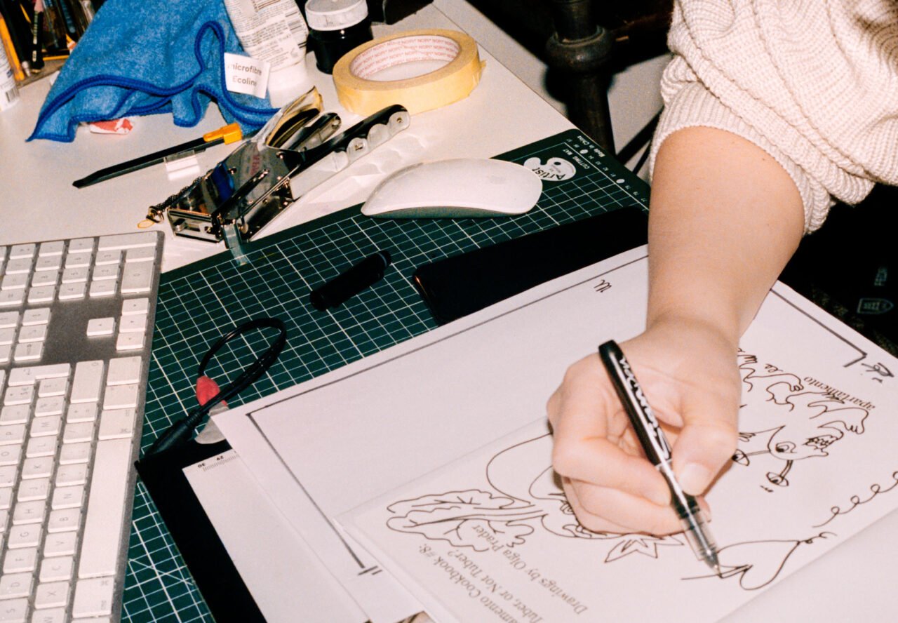
What is your creative process like? Has it always been the same, or has it changed through the years?
I think it has changed. When I started drawing, I was drawing all the time. Now, it’s become work. You do it during your day at work, and then you kind of stop. I’m quite obsessive when it comes to drawing. With Apartamento Cookbook #8: Tuber, or Not Tuber?, I couldn’t stop. It was super tricky because I had to take care of the baby, but I wanted to keep drawing.
When I think about your drawings, I think about the human condition. Even if a human is not pictured, a figure will have human traits. They’re very expressive, and there’s always humour and that horniness you mentioned as well. What was your approach with Apartamento Cookbook #8: Tuber, or Not Tuber?, the latest in our annual series?
The underground theme was a good starting point, I think. I was wary of things being a bit boring in the dirt. I started with the ‘Spicy Pork Miso Soup’ recipe.
By Motoyuki Daifu?
Reading the story, it’s really about staying home with a cold, which was fitting with this underground theme. On top of illustrating the story and the recipe, the challenge with the cookbook was portraying the chefs accurately. This is not easy.
I see what you mean. It’s not as free because it has to look like the person.
You cannot push them into a situation they are not in. You can’t imagine anything different after reading their text and seeing their photo. So that was the initial frame. But then, the first reference after that was all these kid’s books where you can see this mole digging under the earth and having a little house, and it looks really cosy. And then the other starting point was all these tubers and ingredients. To look at pictures of these plants and discover that they actually have giant leaves or very interesting flowers. I started looking at tuber shapes and how they can be a bit sexy, a bit funny, or a bit weird. And wondering who can be living under the earth? What kind of creature? If it’s a chef, what are they doing?
I love that.
The cool thing with drawings is that they’re not words. The way you do a stroke will tell a story. I think that’s why drawings can be really complex. You don’t need to show everything. I really see graphic design, but also illustration and drawing, as a craft. You just have to do it. When you’re doing and drawing, you start thinking and dreaming and telling yourself jokes.
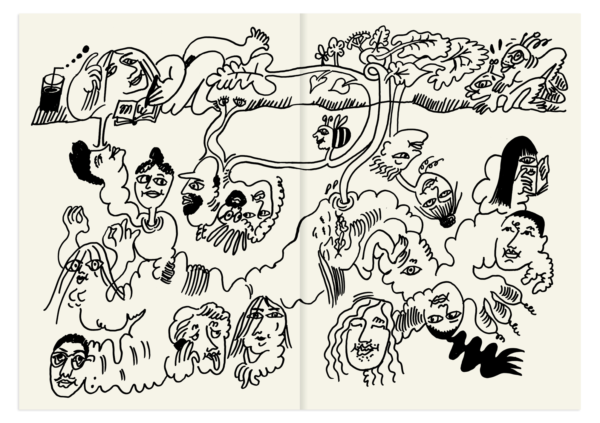
Each drawing converges in the middle spread, creating a larger story.
At one point, the centrefold was just a giant, sexy party between all the chefs and the tubers and the earth. And then at another point, it was a theatre play by the tubers for the chefs. I started drawing towards the end of June, and then we finished in August. I was working on the drawings every week, and I was constantly changing my approach. At one point, you feel comfortable drawing beetroots because you’ve done so many. So I’m going to go crazy with beetroots because I’m fed up with doing the beetroot and the portrait. It’s not enough. I need more. In the beginning, I think I was really shy. Not shy, but trying to please the frame, to portray the recipe, the ingredient, the chef. But then, you have all these other stories coming in, and I like that.
Do you draw any inspiration from your own life?
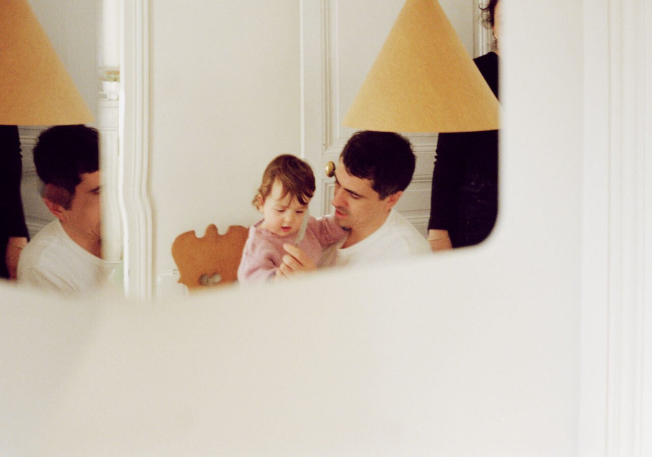
The faces I’m drawing—somehow they look like me a bit. That’s why, in the end, there were so many cover versions. I added big eyes, and I was like, ‘Maybe these are my eyes’. And then the sweet potato doing drama on the back cover—that’s my boyfriend, who is an actor. The worm is my kid. I love that, and that’s for me.
That makes me look at your drawings from a different point of view! With this in mind, how would you describe your creative process, and are you aware of it when you’re in it? When I write, I’m afraid of being too literal or too obvious, but I feel like it’s something that you learn as you do and maybe the more you do it the more sophisticated it gets?
Totally! I feel like I was too literal at the beginning of the process for the cookbook. I loved all my ideas, but when I started to execute them, they weren’t working. You have to get it to a certain level. And the way I draw, it’s super repetitive. I will do 10 or 20 versions for one drawing or one idea. I have to put myself into it and tell myself the story, so it becomes really present. Then you have to do it. And the more you do, the better you get.
I was listening to an interview with a singer, and she was saying, ‘How do I create a new song? Well, I just sit at the piano, and I do the same notes all day long. I’m like, la la la la la la la, and then at one point, I have a new song’. I think it’s a bit like a trance.
It also reminds me a bit of an avalanche. A lot of the strength of your process seems to come from this moment of generation.
Yes. And, you know, maybe it comes from graphic design, because you are working while you produce. You think at the same time. It’s not like I have an idea, and then I do it and try to execute it perfectly. You do and think simultaneously, so you’re always producing. I don’t find my drawings beautiful. But the process of doing them, that’s the best part. That’s why they have value.
I’m teaching in France right now, and it’s super hard to share that experience with students. I think here, people are used to having an idea, developing it, finding references, and then executing the idea. And I’m like, ‘Start doing!’
Do you feel like you really learnt this at ECAL? Or was it more something you learnt afterwards while working?
No, it really started at ECAL. I think maybe Swiss graphic designers are more like craftsmen and -women than French graphic designers. You have to do a dummy of the book. You don’t wait until the end to pick the paper, for example. You consider the printing technique from the beginning of your project.


I love that. When I was studying graphic design, it was a bit similar to what you’re saying about France. The first part of the process was slow for us.
I think it’s also really cultural. What is considered intellectual, and what is not? In France, maybe it’s a little cliché, but if you don’t have lots of references and you don’t speak well about your projects, it’s worth nothing. Even if the book looks great. You really have to talk around the project.
What did you do after you graduated?
The year after graduating, I was an assistant at the school. After that, I decided to go to Paris because my boyfriend is French, and he could only work in Paris.
Before, you said you used drawing to seduce. Did you seduce your boyfriend with the drawing?
No, I sent him drawings after we got together. But I had this phase in school where every two weeks, I would fall in love with someone new. Like, ‘Oh, this guy on the third floor’. I would send a drawing, and then let’s see. Sometimes it worked, sometimes it failed. But it was fun. I mean, I’m shy, right? It’s easier to do that than go and talk to people and say hello.
How was your time in Paris?
I wanted to go to Zurich and do typography and be a Swiss designer, but I went there and I started assisting an art director called Julien Gallico. He works with fashion projects, identities, and lots of art direction. It was super nice. I really love this man. He studied at ECAL, but he was not working as a Swiss graphic designer at all. I worked with him for one year, and he was doing all the Balenciaga graphic design elements while Nicolas Ghesquière was there. Then Ghesquière left, and Alexander Wang arrived, and this was maybe two or three months after I started assisting him. They said, ‘OK, can you do the new logotype for Balenciaga?’A dream come true. I did lots of sketches and research and drawings. But I’m not a type designer either, so I just did it by hand and on Illustrator. I was like, ‘We need to find a typographer to finish the logotype. I don’t feel comfortable with this going out’. It was super nice because the head of the communication of Balenciaga—he was this super chic, elegant guy—he kept calling me ‘Gutenberg’. I was like, ‘OK, he really thinks I’m a type designer’. This was my first project. I learnt a lot, and he gave me freedom, but at the same time, he would check in.
Later, I applied to M/M because someone was leaving, and I got the job. I stayed there for a bit more than three years doing graphic design. When I arrived, I was working on the new Loewe identity, then the Louis Vuitton identity, and then Alexander McQueen. Step by step, I moved from doing books and identities and branding to doing art direction, as well. First, it was doing the photo shoots of bags on white backgrounds for Loewe, and then it was, like, a lookbook and the backstage photos for Alexander McQueen. This grew, and during this time, I discovered more than just being on InDesign and the FontLab all day.
Are you doing art direction and graphic design now, or mostly illustration?
For a year now, it’s mainly been illustration. After M/M, I did art direction for two years in Sweden, for all the visuals for Arket. Afterwards, it was a bit mixed: a shooting here, and a bit of drawing there, and maybe a book or a logotype. Now, it’s mostly drawing, and I’m happy with that. It’s also that at one point drawing was not paying at all. Art direction pays really well. There was a bit of financial balance to find.


That’s a good point.
Have you done any recipes from the book?
No, have you?
Not yet. I’m thinking I’ll start with the sweet potato cake.
That’s the one that I would like to try, as well. Do you like cooking?
I don’t dislike it, but I’m not a good cook. And we have a really tiny kitchen, and it doesn’t help.
Yeah, you don’t get excited about cooking when you have a tiny kitchen.
You have to clean all the time and dry immediately. I mean, I’m sure if I had a giant kitchen, I would be a great cook.
I was using this same excuse with a friend the other day. My kitchen doesn’t invite me to cook, you know? I see everything there, and it’s all so cramped.
Exactly. And you need, like, a better pot and a nicer oven. So maybe one day I will have a house with a big kitchen and I will cook more.
When we have a big kitchen, we can invite each other over to eat something.
Olga Prader’s illustrations are featured in Apartamento Cookbook #8: Tuber, or Not Tuber? along with Vadim Otto Ursus‘ Beetroot with Sloe Berry and Labneh, Alice Moireau’s Manioc Enyucados with Cheese, and Rosie Healey’s A Salad of Jerusalem Artichokes, Parmesan, Walnuts, and Mint, which you can read here.
 close
close


Caldo Rojo de Papa
